> ## Documentation Index
> Fetch the complete documentation index at: https://docs.release0.com/llms.txt
> Use this file to discover all available pages before exploring further.
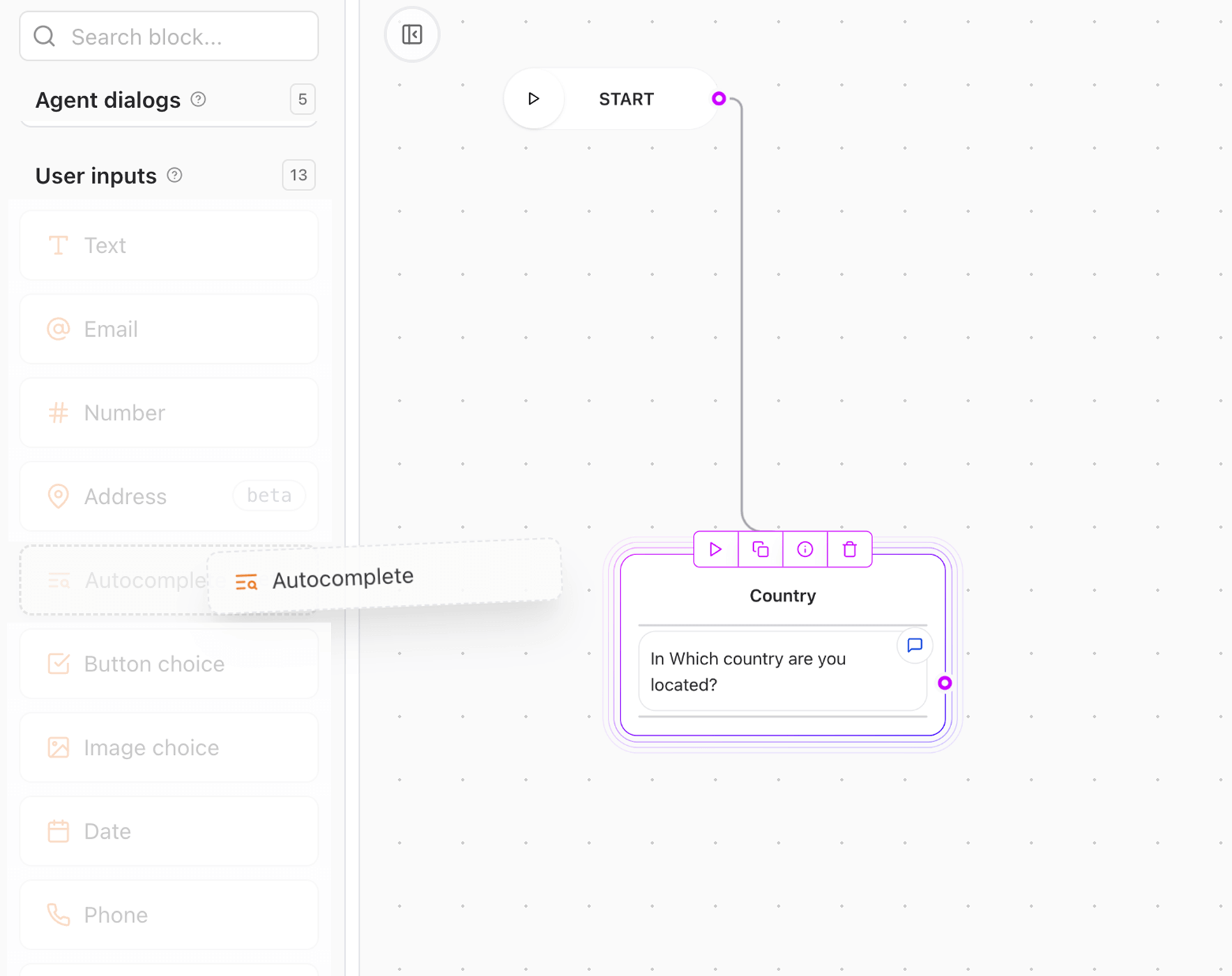
# Use the Autocomplete element to select from large lists
> Add searchable dropdown input with auto-suggestion capability to help users choose from large datasets like countries, languages, or product lists.
The **Autocomplete** User Input element allows users to select an item from a large predefined list by typing to filter suggestions. This is useful for selecting countries, cities, languages, brands, or any extensive dataset that would be cumbersome in a traditional dropdown.
 ***
## Key Features
* **Searchable Dropdown**:
* Users can type to dynamically search and filter available options.
* **Support for Large Lists**:
* Efficiently handles long item lists (e.g., 200+ countries) with performance optimization.
* **Key Value Pairs**:
* Each item can have a display name and a return value, allowing for flexible data handling.
***
## How It Works
1. The element renders a text input field.
2. As the user types, a dropdown appears with suggestions matching the input.
3. Users can select an item from the dropdown, which is then saved in a specified variable
4. The selected item can be used later in the flow for conditional logic or data processing.
## Setup Instructions
1. **Add the Autocomplete Input element**:
* Drag and drop the **Autocomplete** input element into your flow.
***
## Key Features
* **Searchable Dropdown**:
* Users can type to dynamically search and filter available options.
* **Support for Large Lists**:
* Efficiently handles long item lists (e.g., 200+ countries) with performance optimization.
* **Key Value Pairs**:
* Each item can have a display name and a return value, allowing for flexible data handling.
***
## How It Works
1. The element renders a text input field.
2. As the user types, a dropdown appears with suggestions matching the input.
3. Users can select an item from the dropdown, which is then saved in a specified variable
4. The selected item can be used later in the flow for conditional logic or data processing.
## Setup Instructions
1. **Add the Autocomplete Input element**:
* Drag and drop the **Autocomplete** input element into your flow.
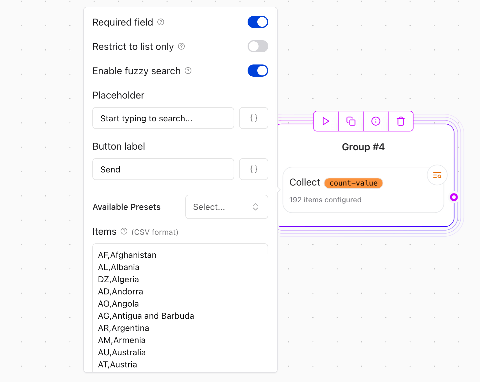
 2. **Configure the Autocomplete element**:
* **Placeholder**: Set a prompt like "Start typing to search...".
* **Button Label**: Customize the button text (e.g., "Search").
* **Available Presets**: Choose from common datasets (e.g., countries, languages) or add your own items as key-value pairs.
## Configuration Options
* **Required field**: Make the input mandatory for submission.
* **Restrict to list only**: When enabled, users can only select from the provided suggestions. Custom entries will not be allowed.
* **Enable fuzzy search**: When enabled, the search will match results even if the user's input contains typos or partial matches. This is useful for large datasets where exact matches are not always possible.
* **Placeholder**: Customizable prompt to guide users (e.g., "Start typing to search...").
* **Button label**: Customizable text for the search action button.
* **Available Presets**: A provided list of common datasets (e.g., countries, languages, communication channels) for quick setup.
* **Items**:
* Define the list of items to be displayed in the dropdown.
* Each item can have a `value` (e.g, FR) and `name` (e.g, France).
* **Max suggestions**: Limit the number of suggestions shown in the dropdown to improve performance and usability.
* **Minimum characters to search**: Set the minimum number of characters a user must type before suggestions appear. Helps to avoid irrelevant results for short inputs.
* **Save selected value to variable**: Store the selected item in a variable for later use in your flow. (e.g, France)
* **Save selected key to variable**: Optionally save the key of the selected item in a separate variable.(e.g, FR)
2. **Configure the Autocomplete element**:
* **Placeholder**: Set a prompt like "Start typing to search...".
* **Button Label**: Customize the button text (e.g., "Search").
* **Available Presets**: Choose from common datasets (e.g., countries, languages) or add your own items as key-value pairs.
## Configuration Options
* **Required field**: Make the input mandatory for submission.
* **Restrict to list only**: When enabled, users can only select from the provided suggestions. Custom entries will not be allowed.
* **Enable fuzzy search**: When enabled, the search will match results even if the user's input contains typos or partial matches. This is useful for large datasets where exact matches are not always possible.
* **Placeholder**: Customizable prompt to guide users (e.g., "Start typing to search...").
* **Button label**: Customizable text for the search action button.
* **Available Presets**: A provided list of common datasets (e.g., countries, languages, communication channels) for quick setup.
* **Items**:
* Define the list of items to be displayed in the dropdown.
* Each item can have a `value` (e.g, FR) and `name` (e.g, France).
* **Max suggestions**: Limit the number of suggestions shown in the dropdown to improve performance and usability.
* **Minimum characters to search**: Set the minimum number of characters a user must type before suggestions appear. Helps to avoid irrelevant results for short inputs.
* **Save selected value to variable**: Store the selected item in a variable for later use in your flow. (e.g, France)
* **Save selected key to variable**: Optionally save the key of the selected item in a separate variable.(e.g, FR)
 ***
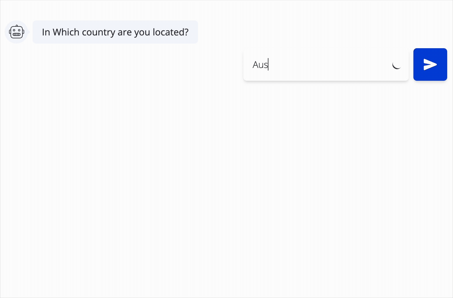
## Example Use Case
**Selecting a Country**:\
Let users pick a country by typing part of the name. The dropdown filters and suggests matches as they type.
* Prompt user: "What country are you from?"
* The user starts typing "Al" and suggestions like "Albania" and "Algeria will appear.
***
## Example Use Case
**Selecting a Country**:\
Let users pick a country by typing part of the name. The dropdown filters and suggests matches as they type.
* Prompt user: "What country are you from?"
* The user starts typing "Al" and suggestions like "Albania" and "Algeria will appear.