Template
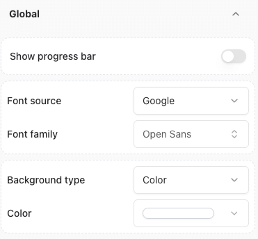
The Template section provides a variety of pre-designed themes to choose from. You can select a template that best fits your needs and customize it further.Global
This section enables you to:- Enable or disable the Agent branding.
- Change the font used by your Agent.
- Customize the background of your Agent.
- Show the Agent’s flow progress bar.
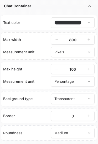
Chat container
This section allows you to personalize the chat window’s appearance. You can adjust the following elements:- Text color
- Max width
- Max height
- Background type
- Border
- Roundness
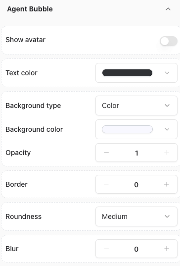
Agent Bubble
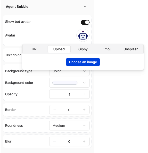
This section allows you to customize the appearance of the Agent’s chat bubble. You can adjust the following elements:- Show or hide Agent’s avatar
- Avatar image
- Text color
- Background color
- Background type
- Border
- Roundness
- Opacity
- Click on the toggle to show the avatar.
- Click on the agent avatar within the Chat section.
- Upload or select a new image.
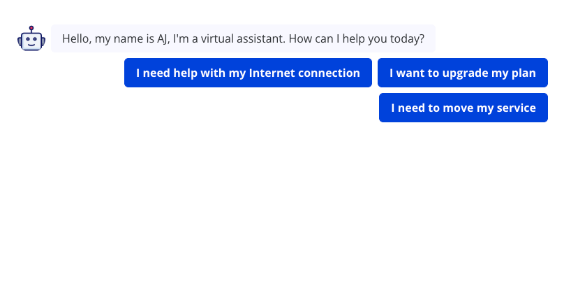
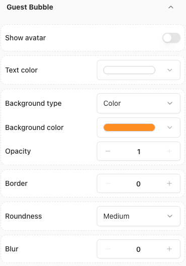
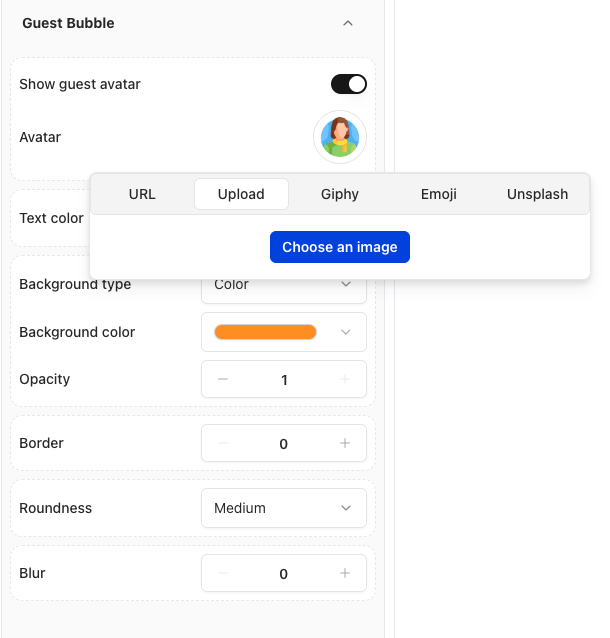
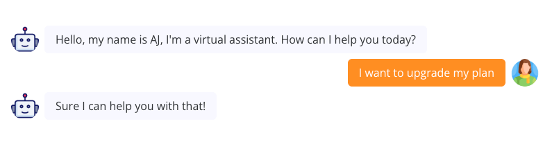
Guest Bubble
This section allows you to customize the appearance of the user’s chat bubble. You can adjust the following elements:- Show or hide user’s avatar
- Avatar image
- Text color
- Background color
- Background type
- Border
- Roundness
- Opacity
- Click on the user’s avatar within the Chat section.
- Upload or select a new image.
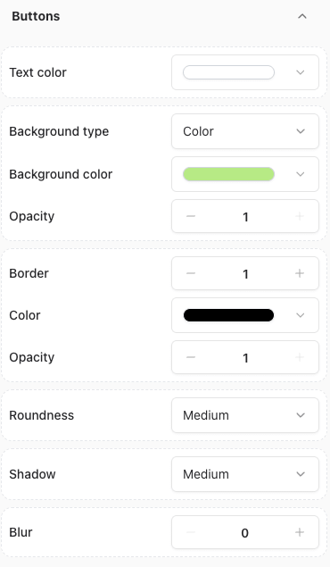
Buttons
This section allows you to customize the appearance of the buttons. You can adjust the following elements:- Text color
- Background color
- Background type
- Border
- Roundness
- Opacity
- Shadow
- builder
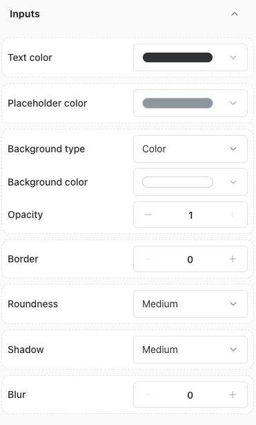
Inputs
This section allows you to customize the appearance of the inputs. You can adjust the following elements:- Text color
- Placeholder color
- Background color
- Background type
- Opacity
- Border
- Roundness
- Shadow
- builder
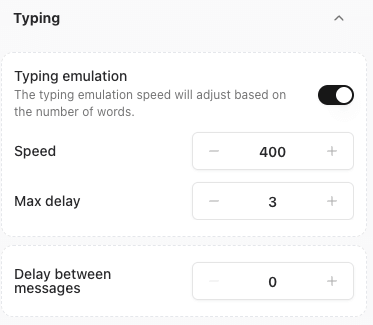
Typing
This section allows you to customize the typing behaviour of your agent. You can adjust the following elements:- Typing emulation:
- Enable or disable typing emulation.
- Adjust the typing speed (in milliseconds).
- Adjust the maximum delay between messages (in seconds)
- Adjust the delay before the first message is sent (in seconds).
Custom CSS
For advanced customization, you can add your own CSS styles.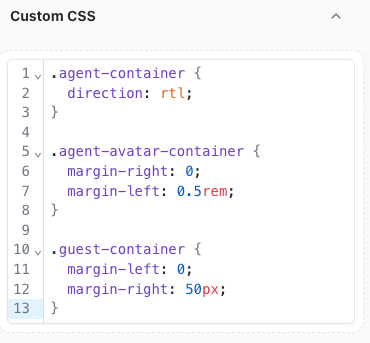
Inspecting Elements for Custom CSS
- Navigate to the Theme page.
- Right-click on the agent or the specific element you want to modify.
- Select Inspect to view and target the element’s CSS.
Example: Rounded Buttons with Gradient Colors
To create buttons with rounded corners and a gradient color, add the following CSS:Example: Configuring RTL chat
You can configure the chat to be displayed in RTL (Right-to-Left) format by adding the following CSS: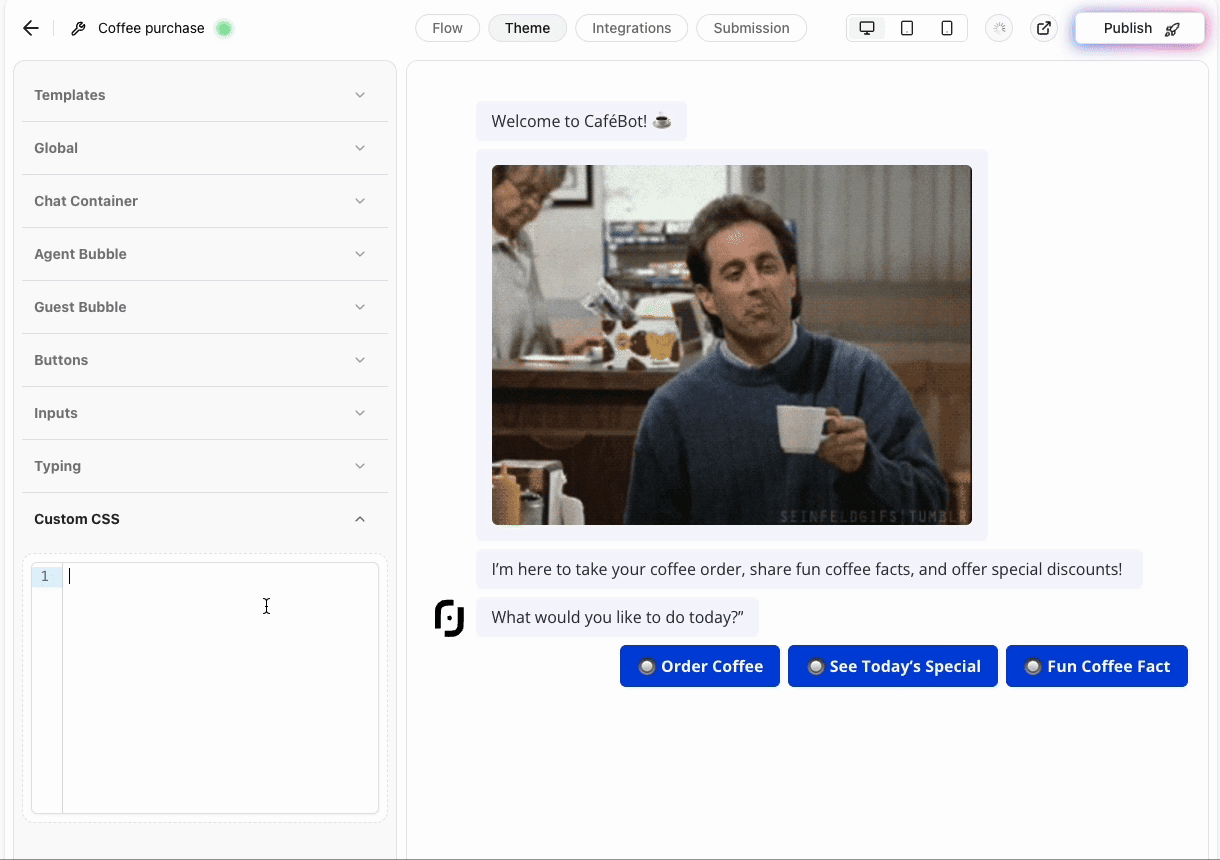
Example: Customize a Single Button’s Color
You can customize the color of an individual button by targeting itsdata-itemid attribute. For instance:
Finding the Button’s data-itemid
- Right-click on the button you want to customize.
- Select Inspect to view the
data-itemidattribute in the HTML.
Note: Always test your customizations in a staging environment before applying them to your live Agent.
Validation and Testing
Before applying your customizations:- Ensure that the custom CSS is properly formatted.
- Test changes across different devices and browsers for consistency.
- Verify that all visual components work as intended.