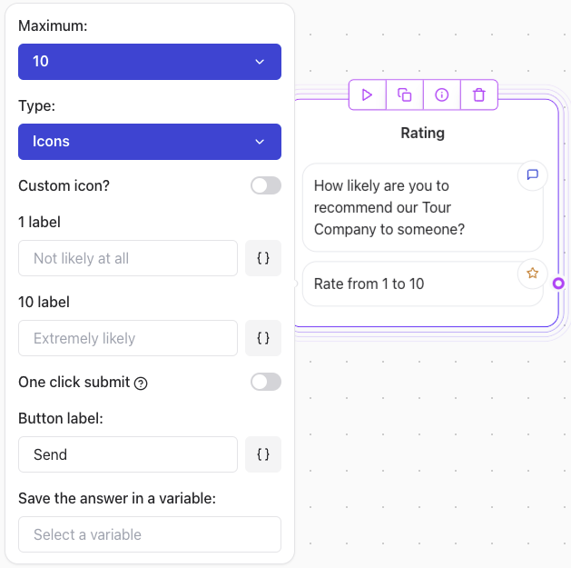
Key Features
- Customizable Range: Define the maximum value (e.g., 5, 10, etc.).
- Type Options:
- Numbers: Display numeric ratings (e.g., 1-10).
- Icons: Use stars or other visual indicators for ratings.
- Custom Icons: Insert your own SVG content for unique designs.
- Bottom Labels: Add labels to specific rating points (e.g., “Not likely at all” for 1 and “Extremely likely” for the maximum value).
Use Cases
- Collect Net Promoter Scores (NPS).
- Request feedback about a product or service (e.g., “Rate your experience”).
- Create fun and interactive surveys using icons or custom visuals.
Configuration Steps
1. Define the Range
- Set the maximum value for the rating (e.g., 5 or 10).
- For Net Promoter Score (NPS), set the range to 10.
2. Choose the Rating Type
- Numbers: Show numeric values for the rating (e.g., 1-10).
- Icons: Use visual elements like stars, hearts, or custom SVG icons.
3. Add Bottom Labels
- Specify labels for certain points in the scale to give context to the rating:
- Example for NPS:
- 1 label: “Not at all likely”
- 5 label: “Neutral”
- 10 label: “Extremely likely”
- Example for NPS:
4. Customize the Submit Button
- Set a label for the submit button (e.g., “Send”, “Submit”, “Rate Now”).
5. Save the Answer in a Variable
- Assign a variable to store the user’s response for later use in your workflow.
Using Custom Icons
To use a custom icon:- Toggle Custom Icon? to enable.
- Paste SVG content into the field. The SVG code should start with
<svg>and end with</svg>. - Find free SVG icons on Feather Icons or other open-source platforms.
Note: Make sure your SVG icon has a consistentviewBoxand size (e.g.,24x24) to ensure proper alignment. Avoid inline styles or fixed dimensions that could break responsiveness.